Color Resources
Color is wild!
You, a baby: just a bit of red, a bit of green and a bit of blue, stand back! I've got this!
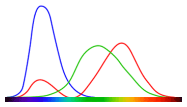
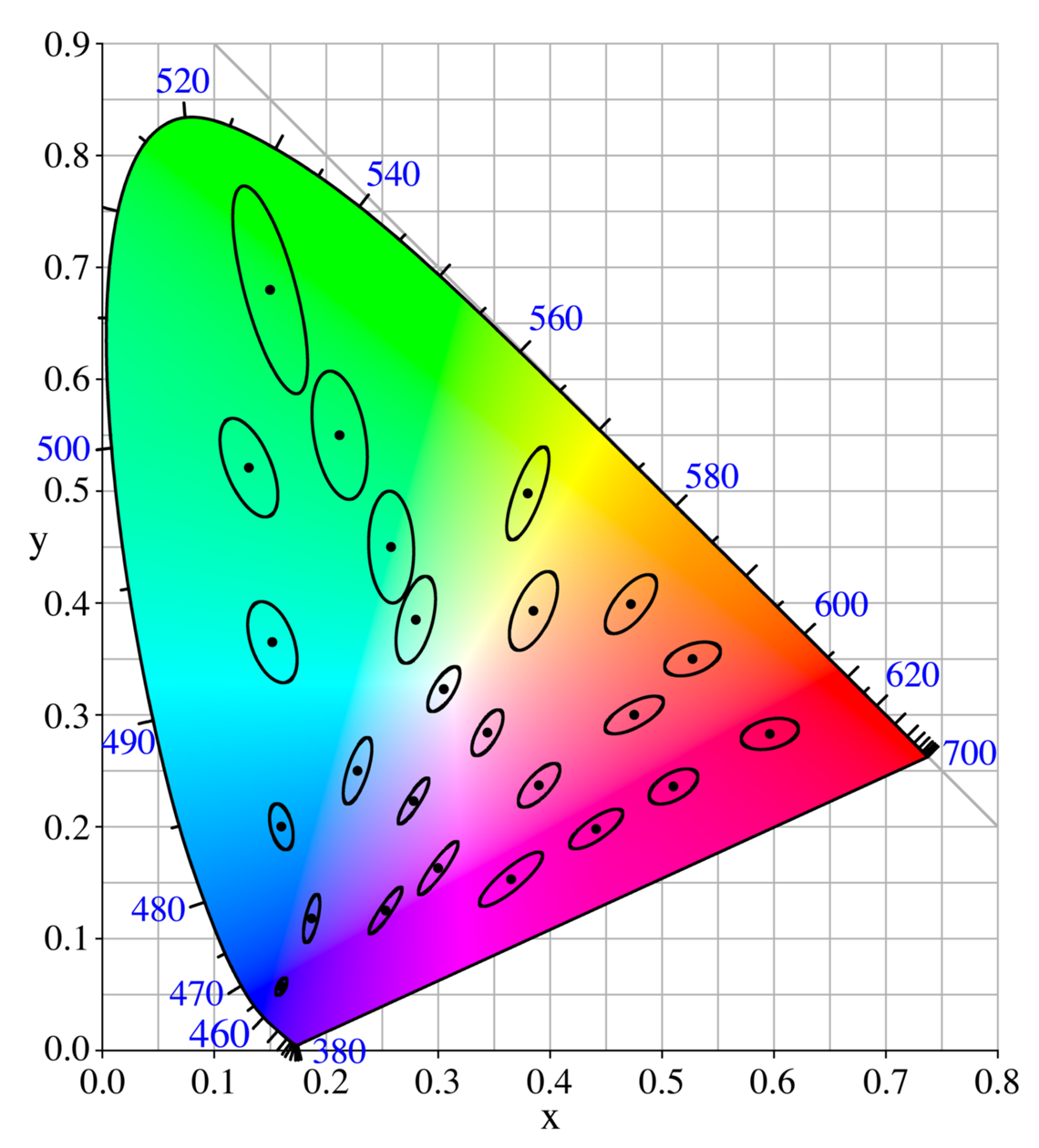
Me, an intellectual: hold on a moment kiddo. There's a lot more to it. Perception is not uniform in that color space you're navigating. And different cultures perceive colors differently, our brain-maps are grown individually, in a context of their own, and it all makes a heck of a difference. Color is out of this world! Even if our brains were all aligned, the retina does a lot of work, with color cones of three different kinds, and sometimes less and sometimes more...
And if you understood a single color (which I doubt you ever can)... these things are deployed in sets, called "palettes" and the way the palettes are combined, the theories thereof, can themselves fill if not a book certainly a pamphlett.
Articles
- How to Master Colour Theory Color Theory 101
- Marketers Guide to Colour
- Color and psychological functioning: a review of theoretical and empirical work
- How the retina works (including, why does violet look a little bit red??)
- Why Monet Never Used Black, notes:
- Red/orange/yellow are "warm"
- green/blue/purple are "cool"
- Warm colors "pop", Cool Colors Recede
- Tints pop, shades recede
- Temperature is stronger than tint
- Temperature can enrich your typography
- Color relationships add life to graphics
- Why Rainbow is bad for data visualizations (and what to do about it)
- One of my goals is to make the rainbow color map as rare in visualization as the goto statement is in programming.
- Rainbow Color Map (Still) Considered Harmful
- Poynter: Why rainbow colors aren't the best option for data visualizations
- Turbo, An Improved Rainbow Colormap for Visualization


↑ "A MacAdam diagram in the CIE 1931 color space. The ellipses are shown ten times their actual size."
Tools/techniques for making visual elements color-blind friendly
Palette Tools
- Google for "Color picker" and you'll find google includes a proficient color picker tool, including conversion between hex/-gb/cmyk/hsv/hsl
- Color Brewer — for gradients to use on maps
- Paletton — good for picking monochromatic, complementary, adjacent, triadic, tetradic and -ree-style palettes.
- Adobe color wheel — previously "kuler", redesigned and improved
- Duotone — Colorize a background
- Dribbble — with dribbble you can search by color and can see the palette used in an image
- Hue Test — Drag and drop the colors in each row to arrange them by ue order.
And finally
- Wikipedia: List of Fictional Colors ... sure to make your designs Pop!